

Amabile Vita
Bolder Than Regular Wine
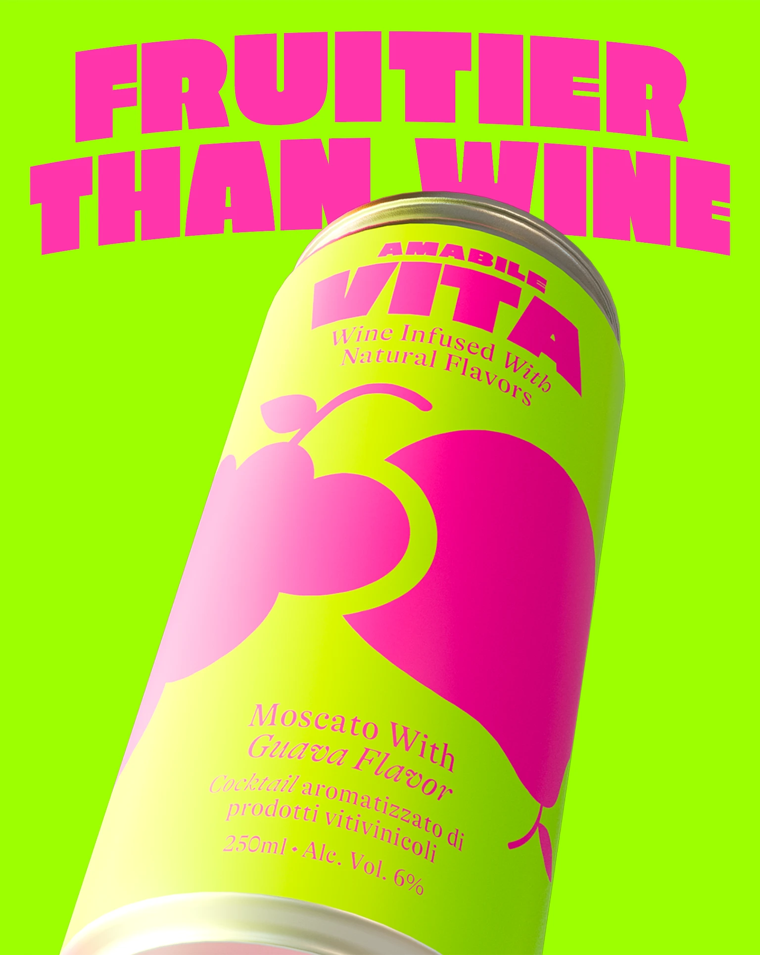
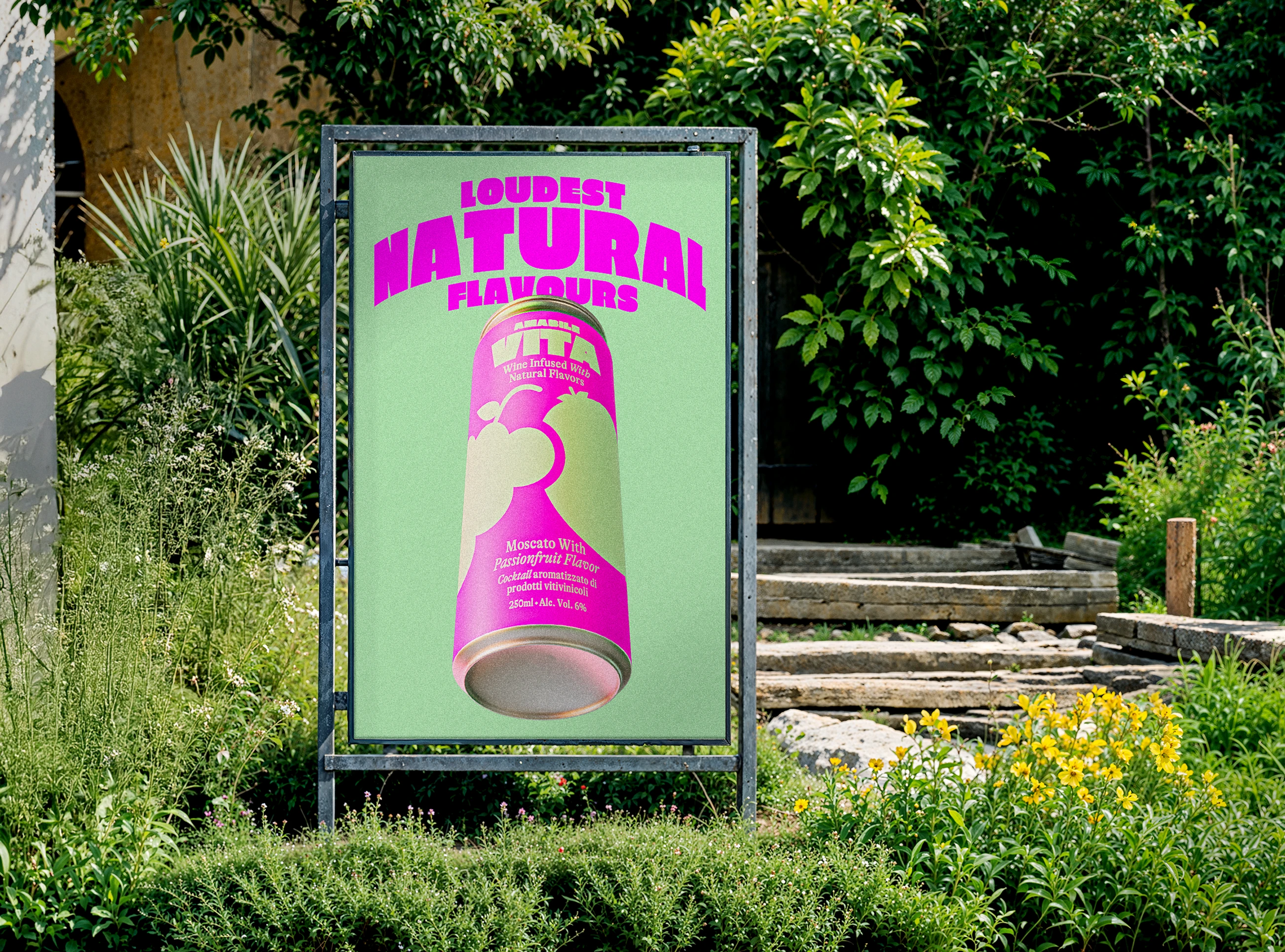
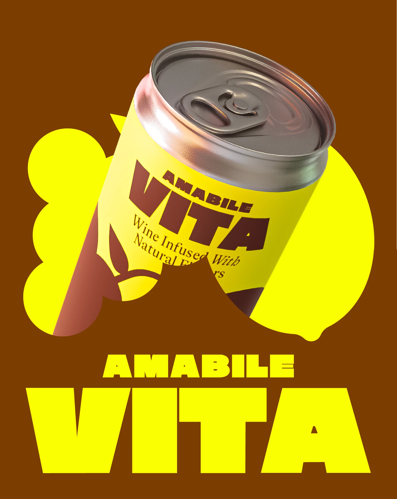
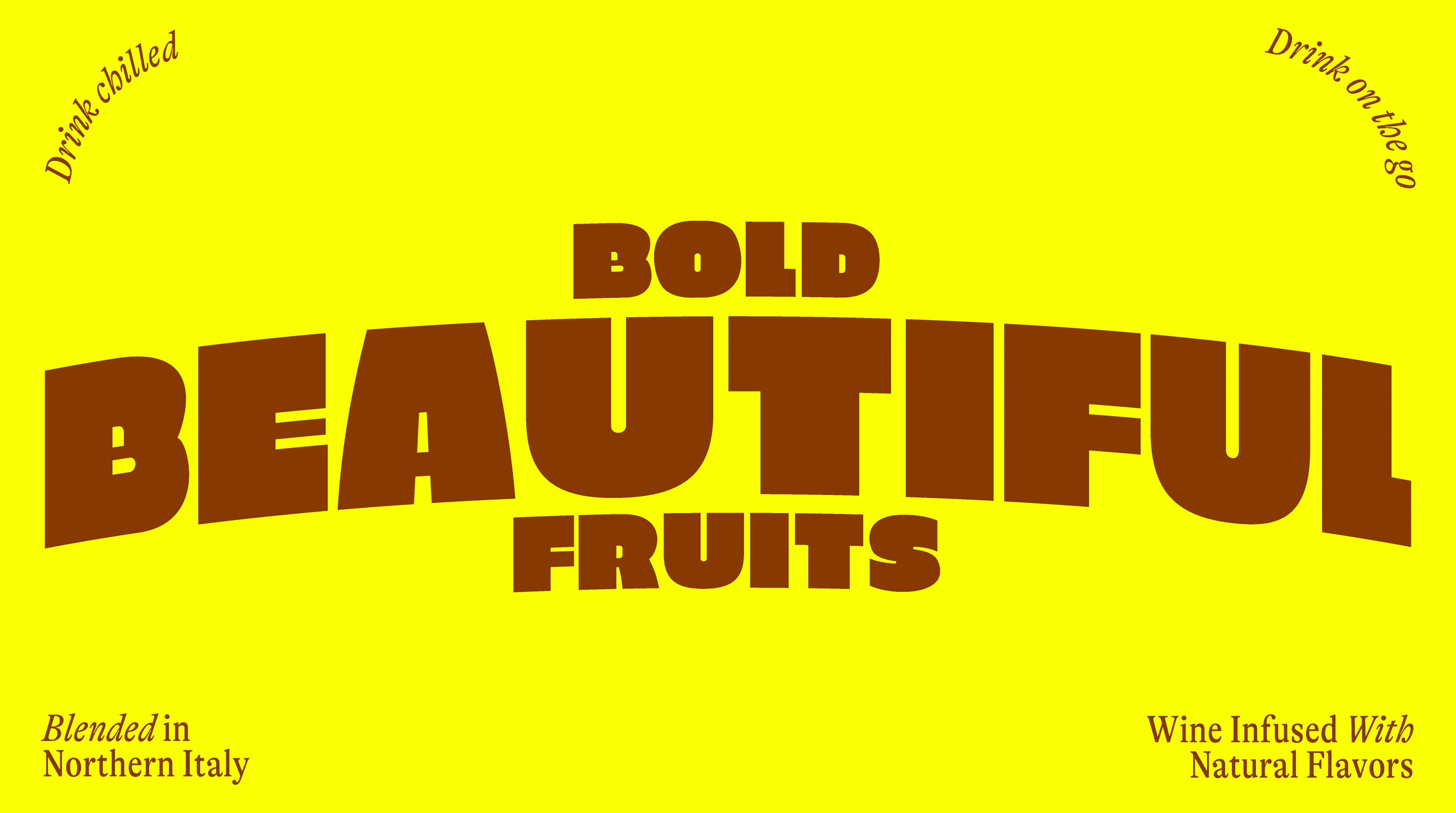
Amabile Vita is a vibrant new range of canned wines, each with a different fruit flavoured infusion to ensure that they are at least 150% more fun than regular old wine. And bold tastes need bold designs, not boring lame designs, so that’s exactly what we set out to create, a range of strong and punchy canned drinks that let your mouth know that a party is on the way.
The Setup
The Vita team approached us with a simple but tricky brief: how could we help them produce a range of RTDs that stand out in an already crowded space? It’s never easy to enter a market that’s already crammed with brands so you really need your product to work a little bit harder. It obviously needs to be visually strong to compete for people’s attention but there also needs to be an interesting point of differentiation so that once you have that attention you can actually tempt those busy busy shoppers into trying your product.
The Delivery
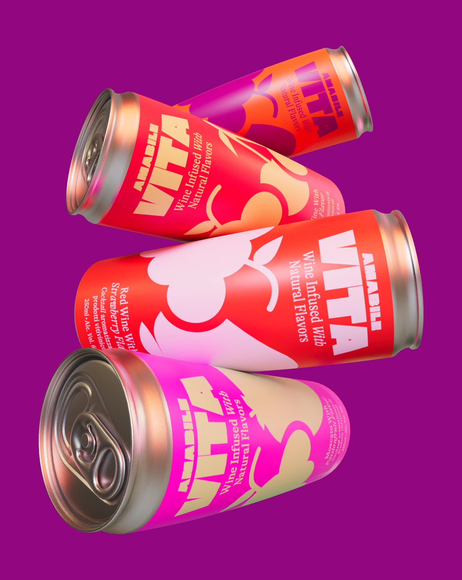
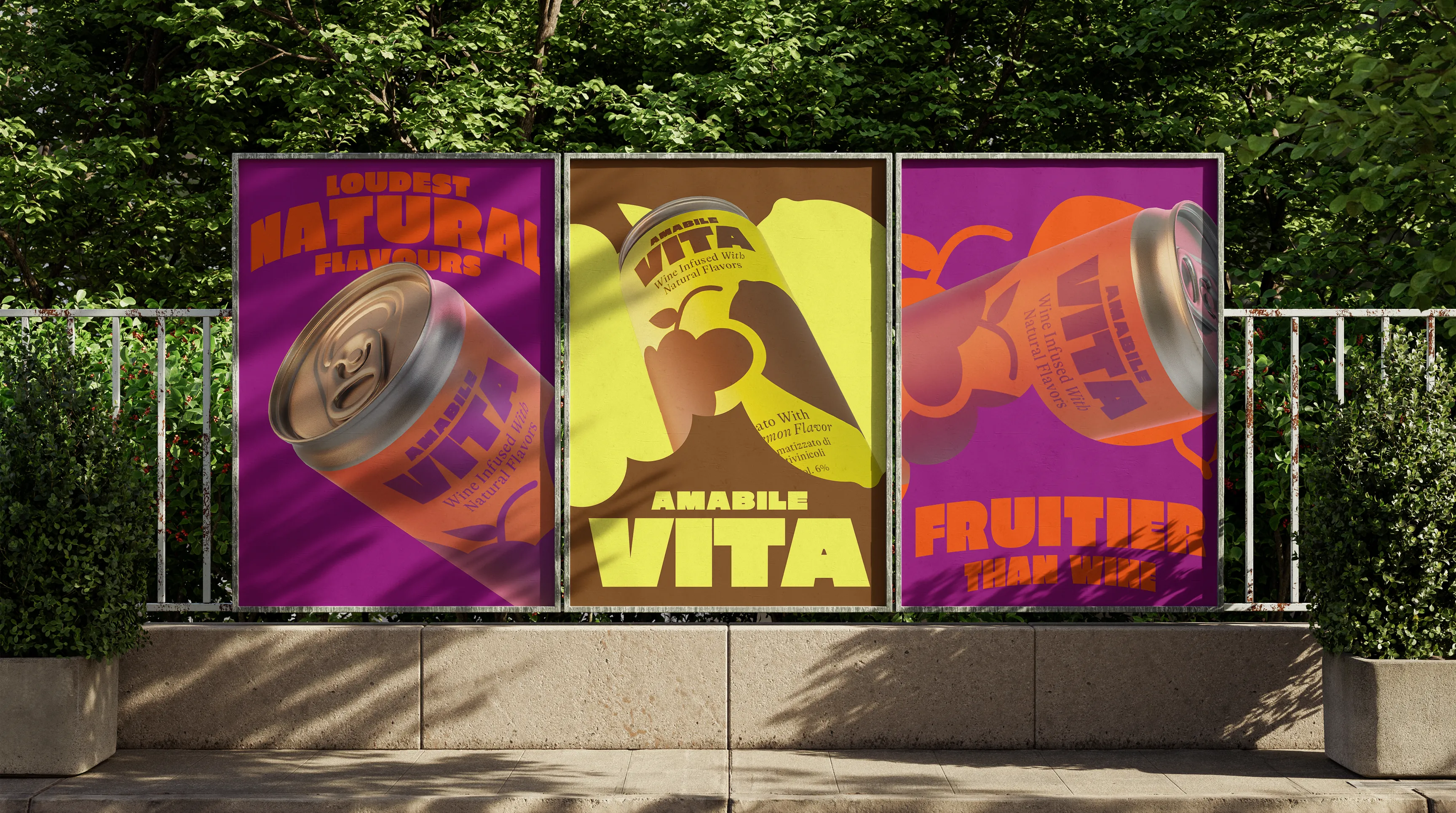
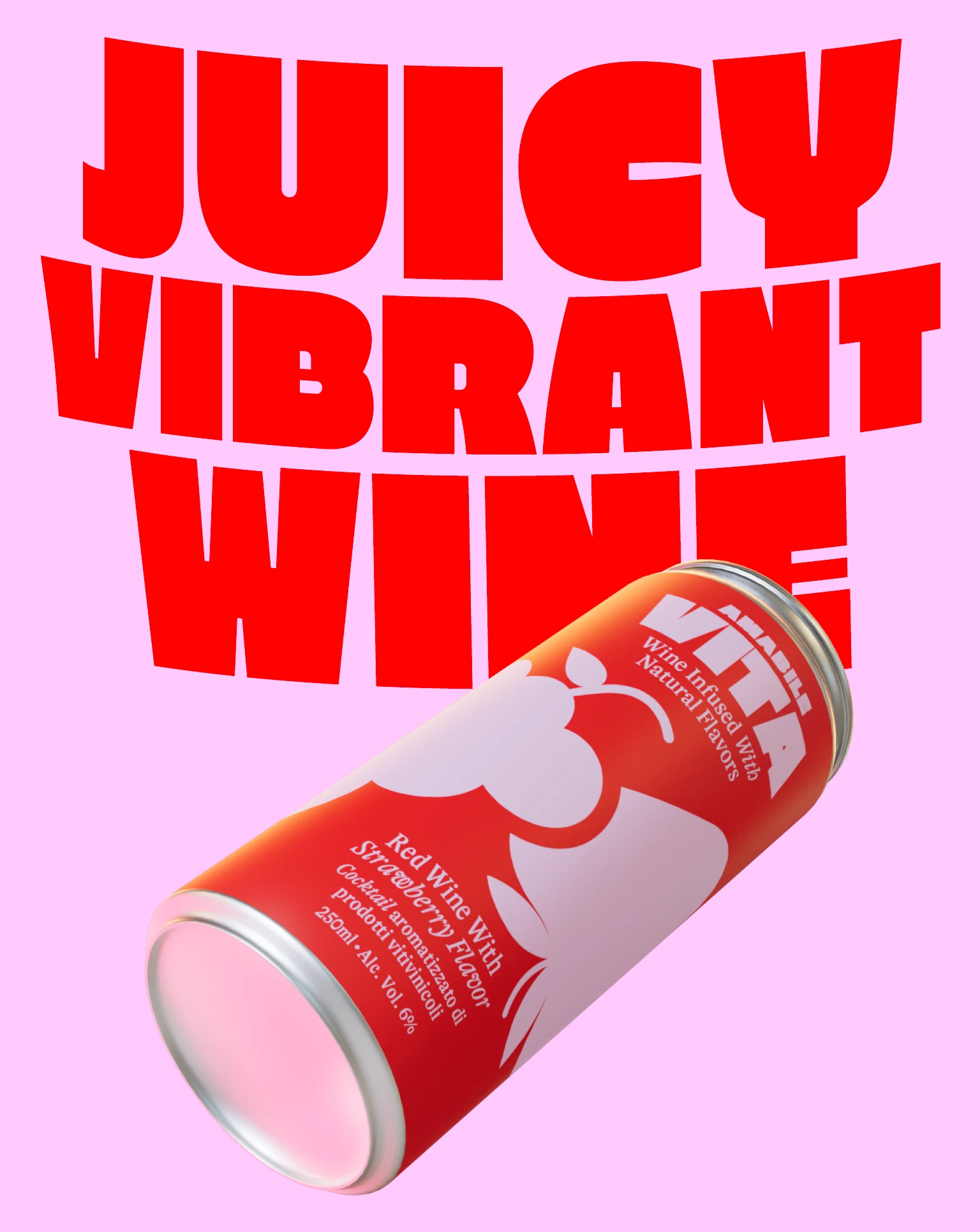
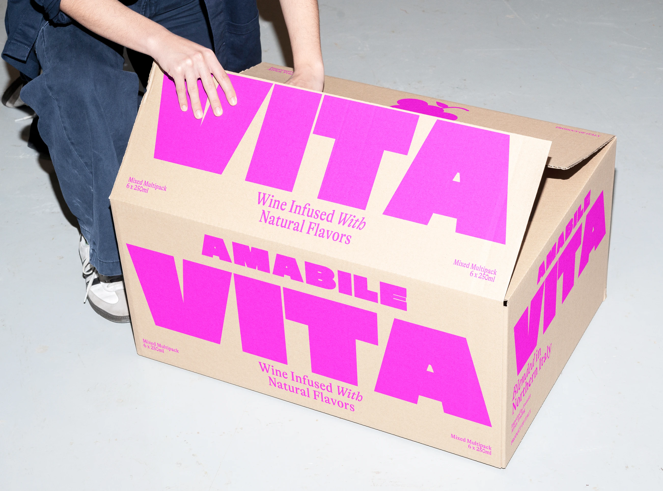
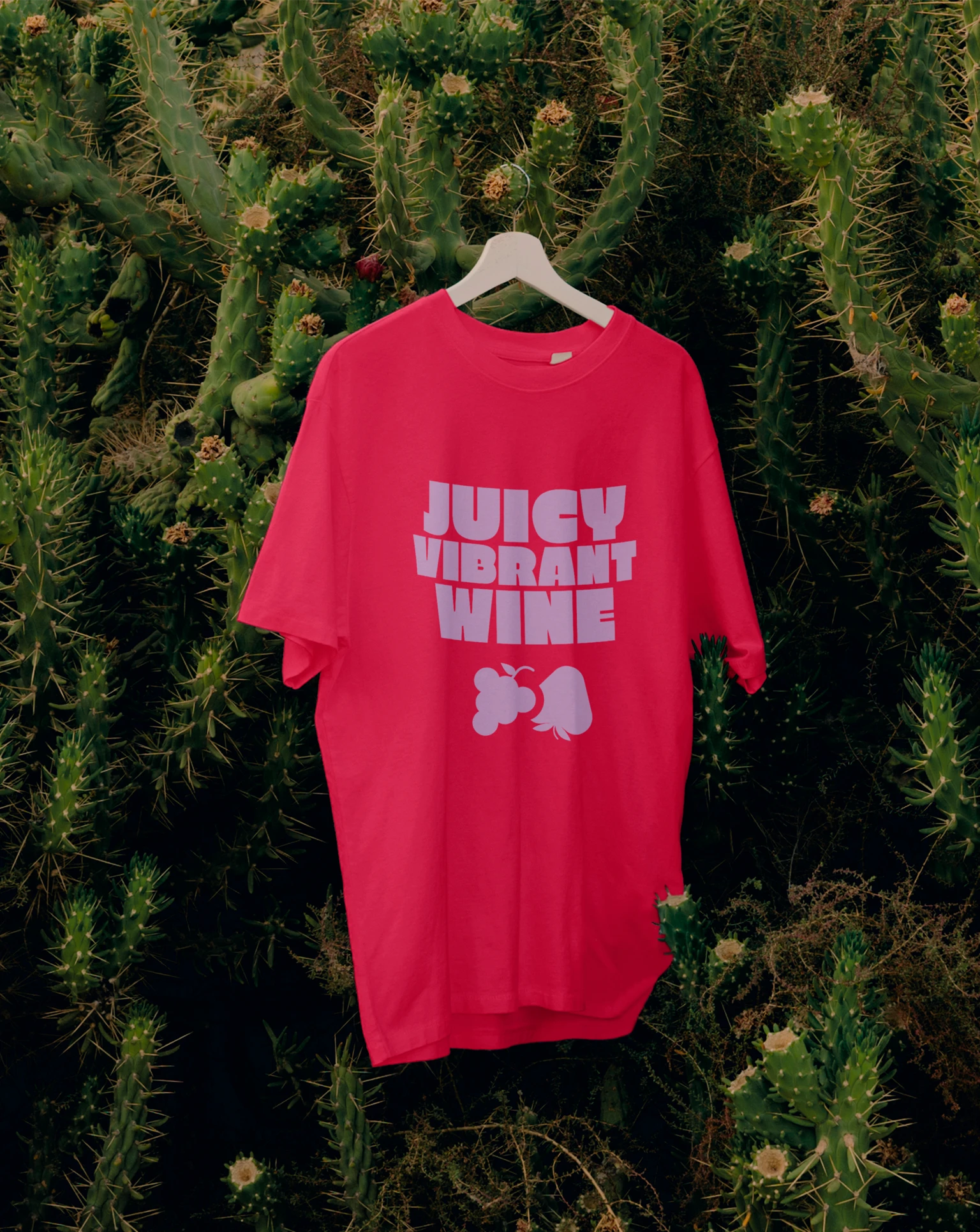
So the first step is naturally getting the packaging design right. We started out by designing a simple yet mighty range using big colours and juicy typography. So far so good, but a can needs more than that to stand out from the crowd. It was also important to bring the vibrancy of the products through in the extended design language of the brand comms, so we created a broad suite of key visuals that show the cans from unexpected angles and in bold, confident crops. In tandem with this we developed the motion design & direction, exploring ways that the product visuals and supporting type could move with a zesty energy, further enhancing the vibe of Vita. The end result is a fearless drink range that's too much for one can to contain. Big movement, big energy, big taste.
Skills
brand architecture
Brand Strategy
kinetic branding
visual identity
packaging design