


Translation Point
Getting Straight to the Point
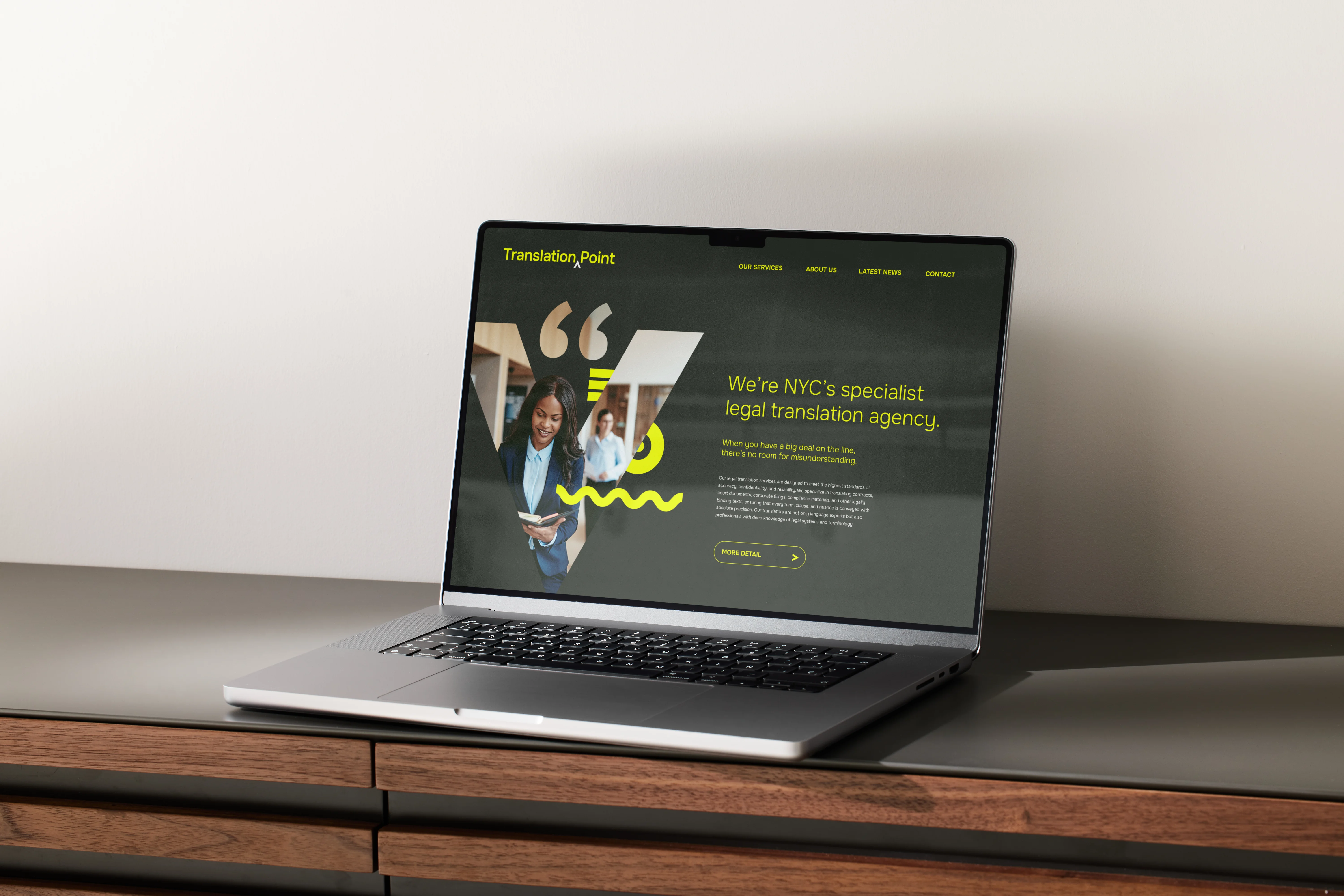
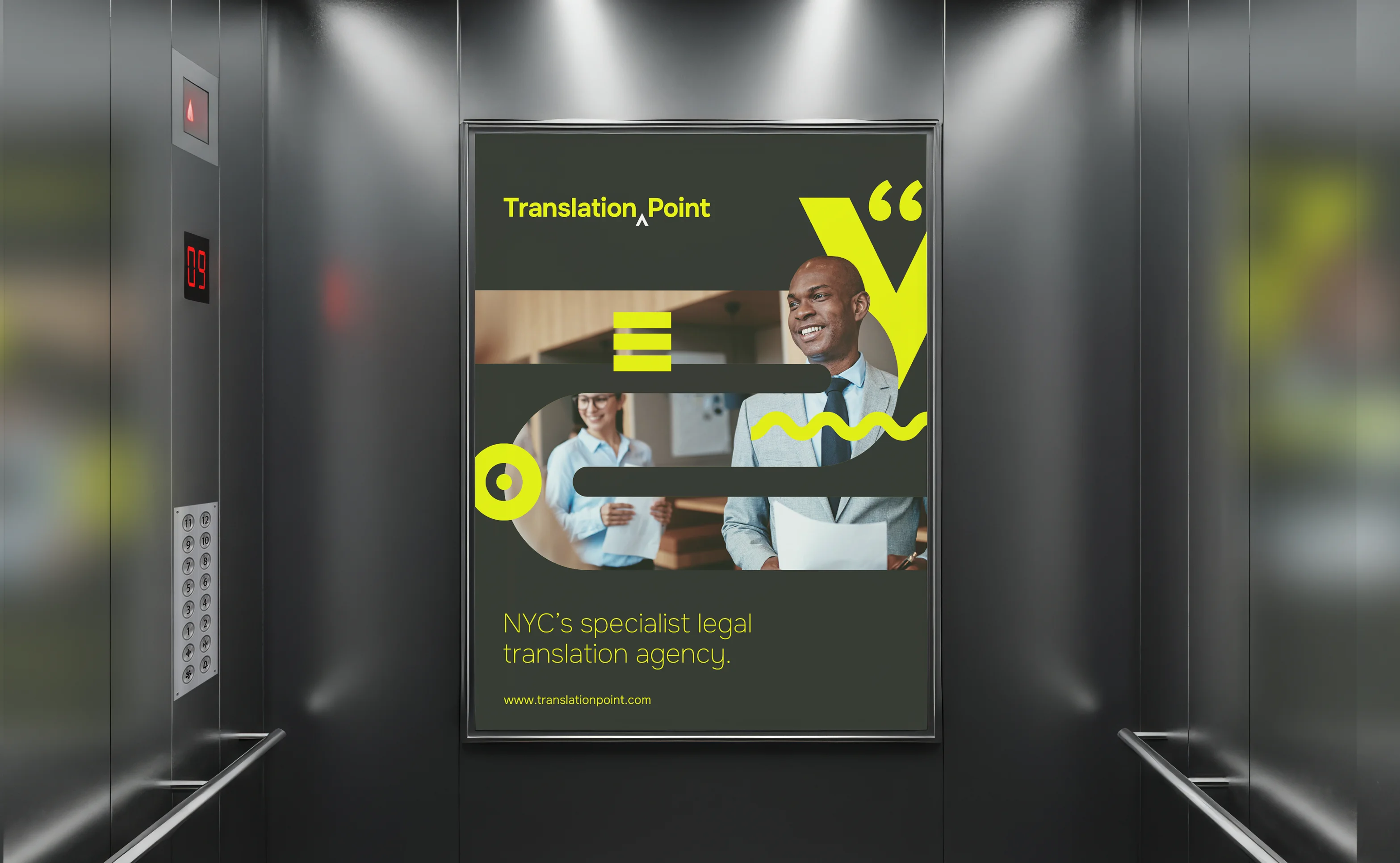
Translation Point are a specialist legal translation agency based in NYC. They are a service that deals with exactitude and clarity, producing accurate translations for complex legal documents that leave no room for error or misunderstanding. We worked with them to create a dynamic new visual identity, positioning Translation Point as a premium, industry-leading service and the go-to name in legal translation.
The Setup
Translation Point began in Central London as Temple Translations (they are based very close to the area of Temple where the majority of London's courts and legal offices are located). The opening of a new office in New York City came along with a conundrum. Why use the name Temple if it has no legal significance in the US? They approached us to help them create a completely new brand that better reflected their services and the legal ambience of NYC.
The Delivery
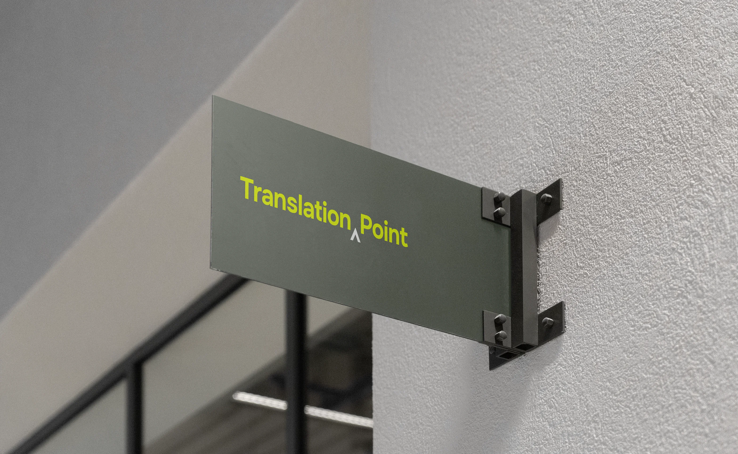
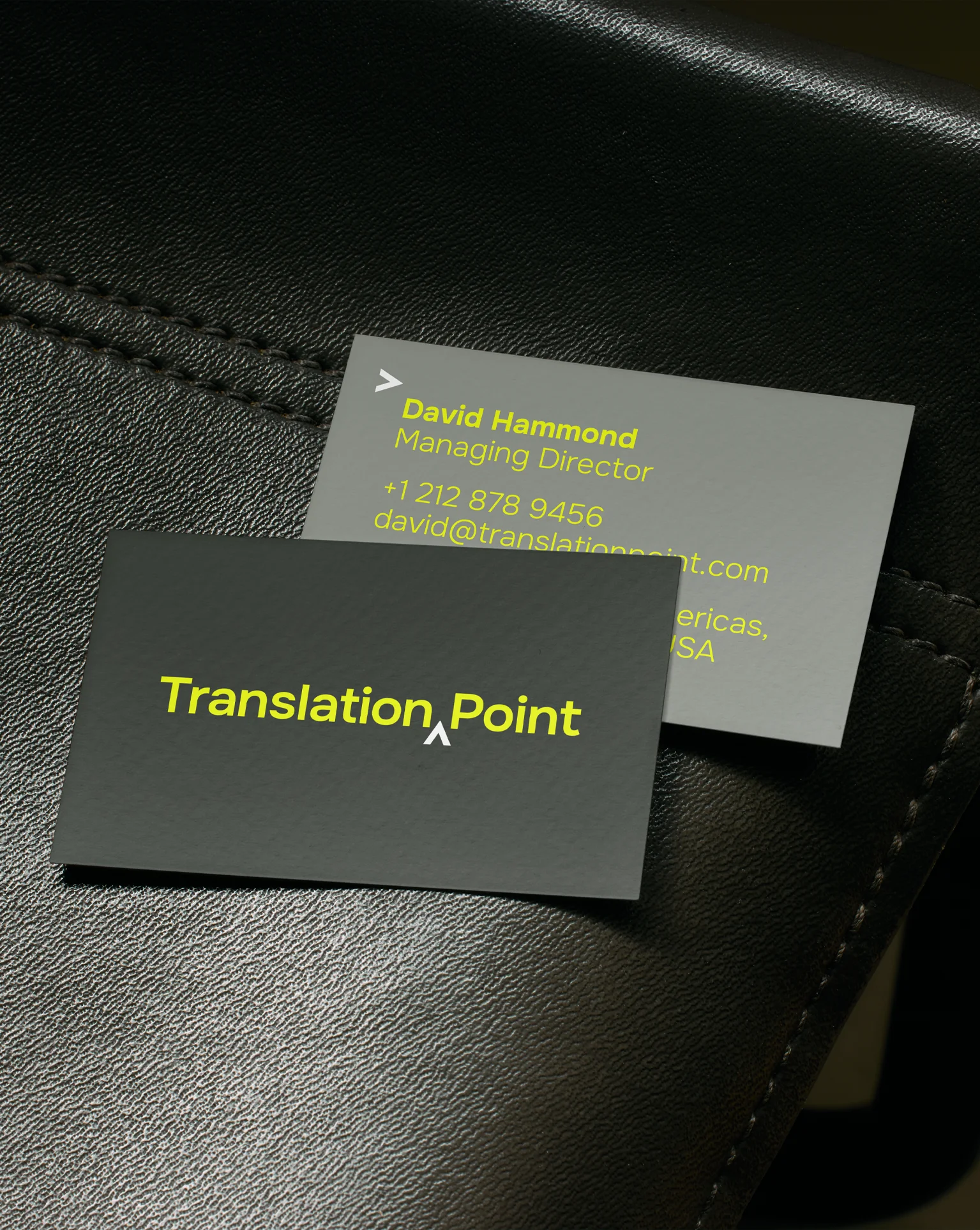
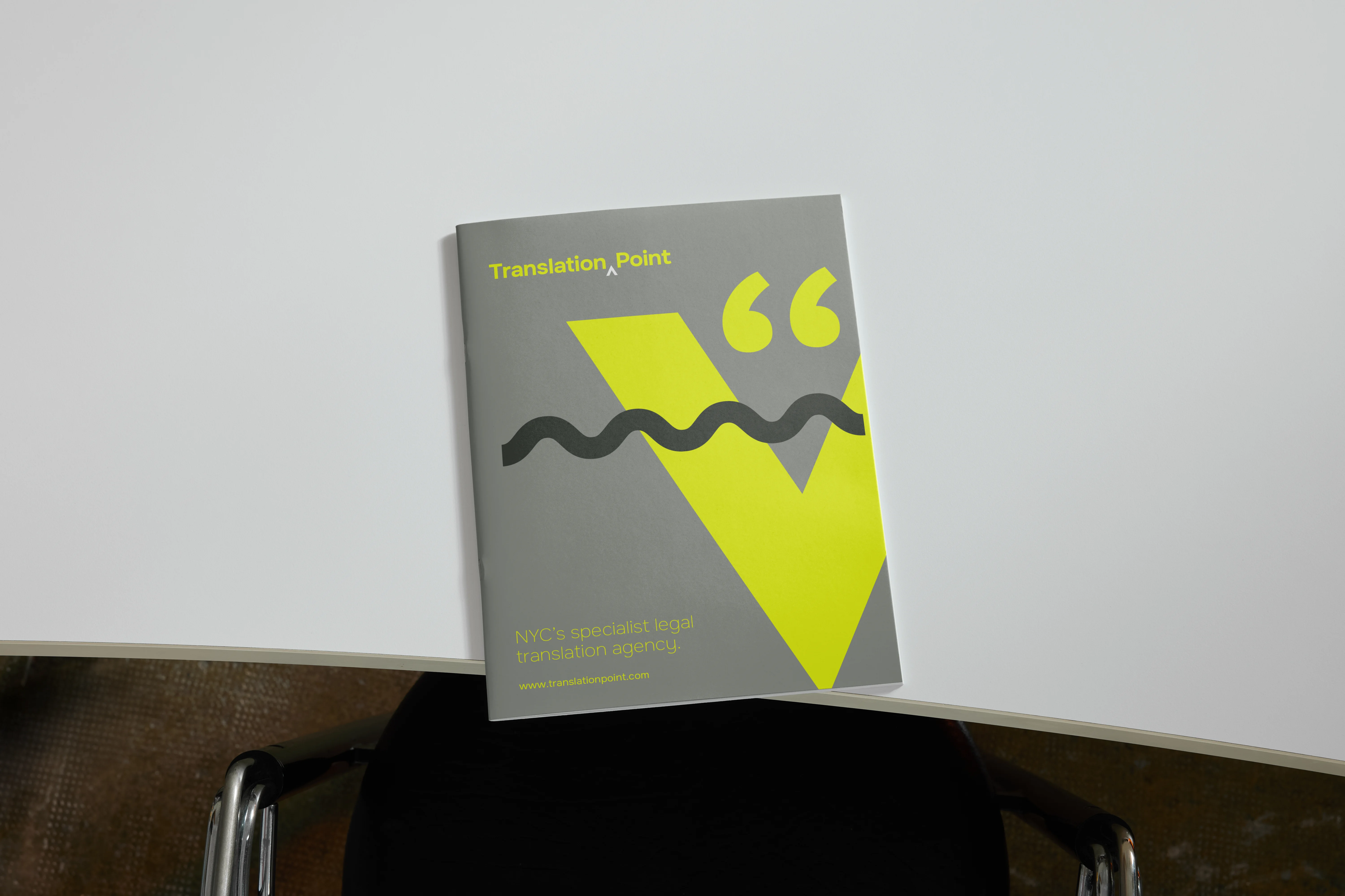
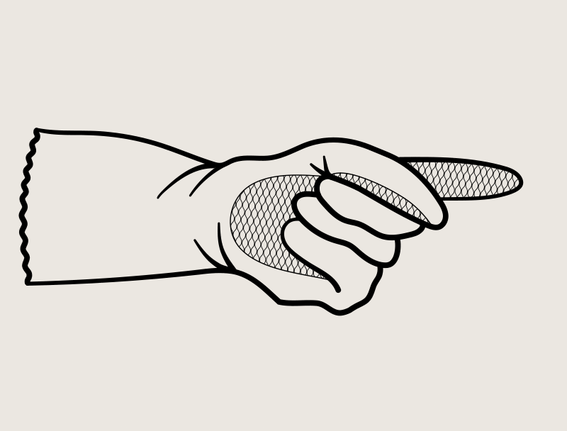
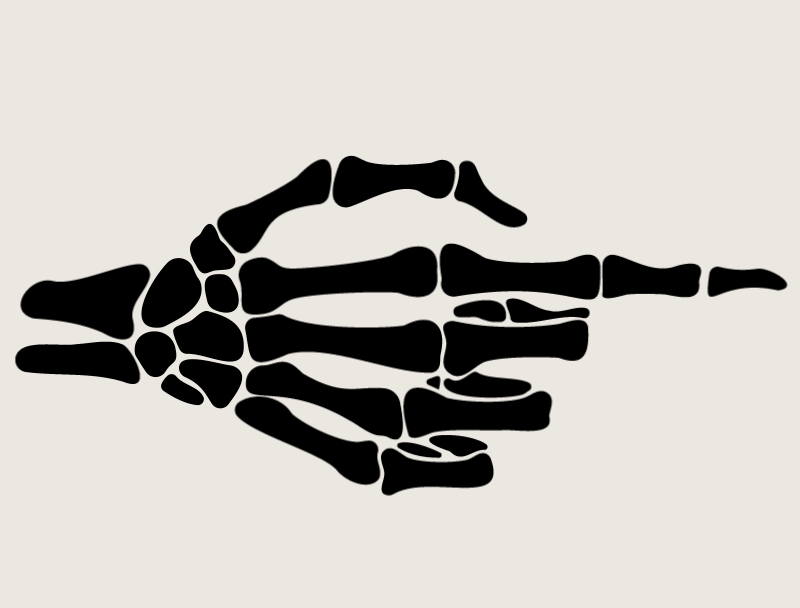
From the beginning, we wanted to explore how the need for accuracy and detail in Translation Point's essential work could be expressed as a visual language. We created a new brand mark and design system that incorporated these characteristics but also one that felt premium and approachable. The system is centred around correction mark-up symbols, each one embodying attention to detail and the pursuit of perfection. To complement this new approach we created a new tone of voice and messaging framework that helps position Translation Point's services as an essential part of the legal process.
Skills
Campaign creative
brand consultancy
Brand Naming
Brand Strategy
design systems
visual identity
motion design
kinetic branding
UX/UI design