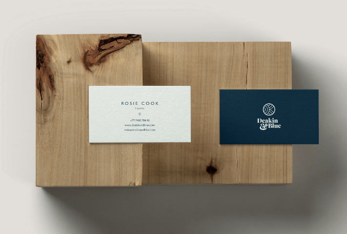
Deakin&Blue
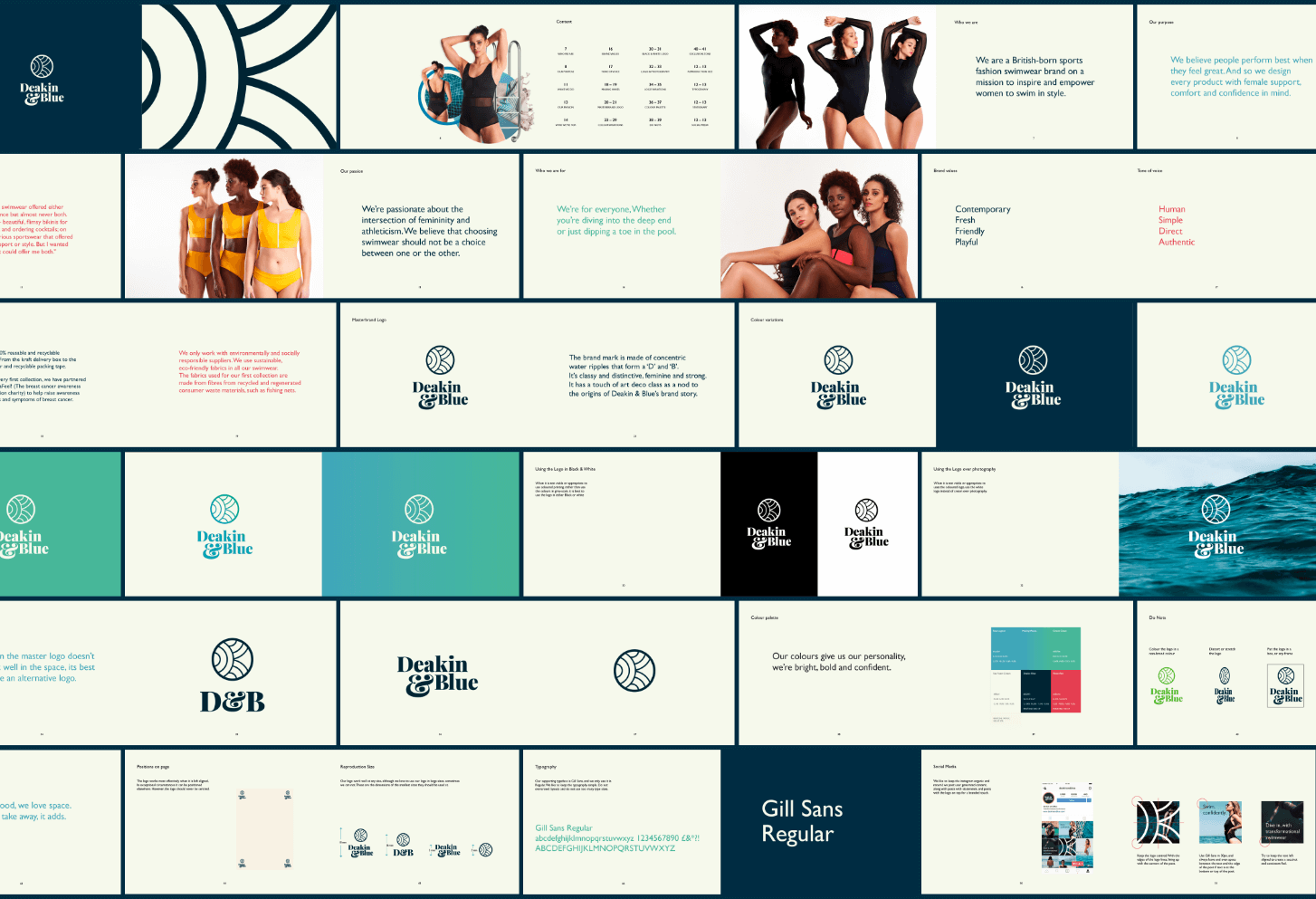
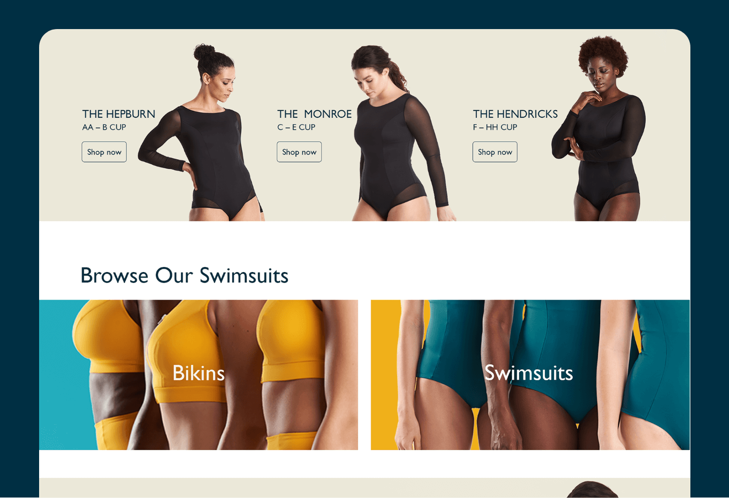
British swimwear brand Deakin&Blue asked us to reimagine their whole visual identity, giving them a cleaner look and a more elegant, distinctive style.
Discipline__
- Brand Identity
- Art Direction
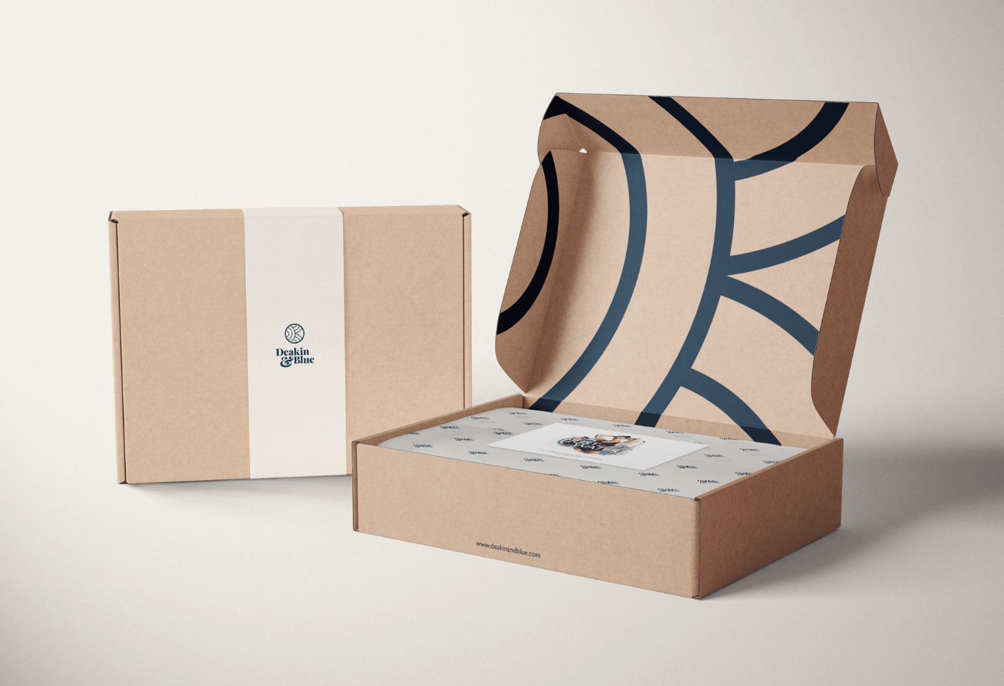
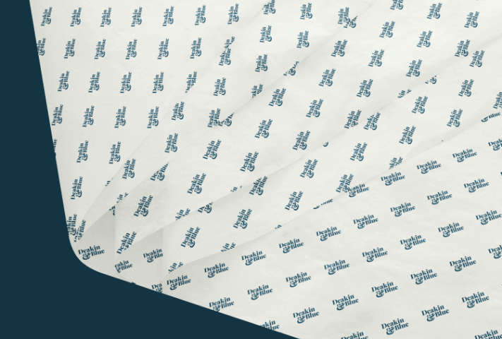
- Packaging Design
- UX/UI
- Project Management
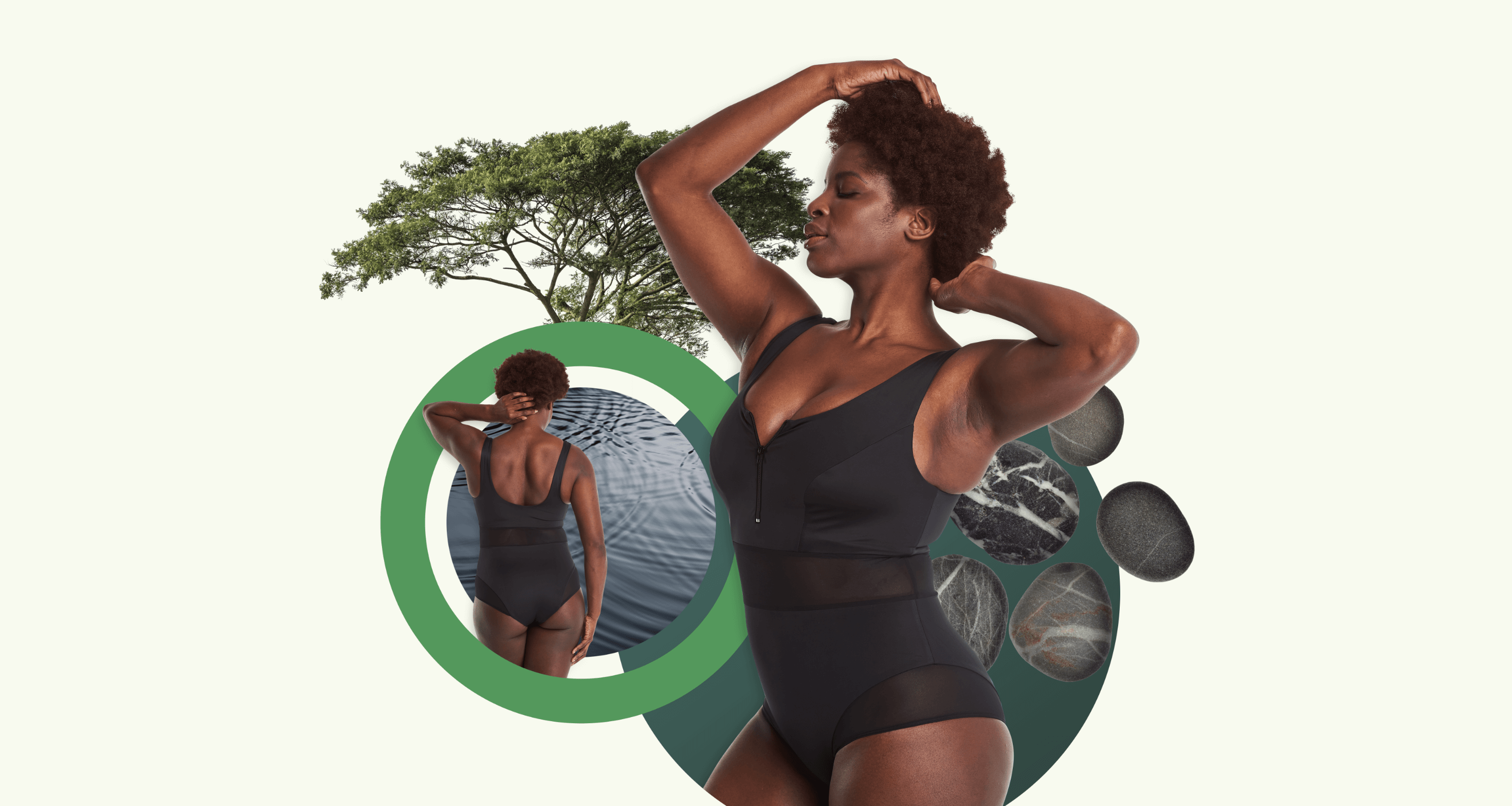
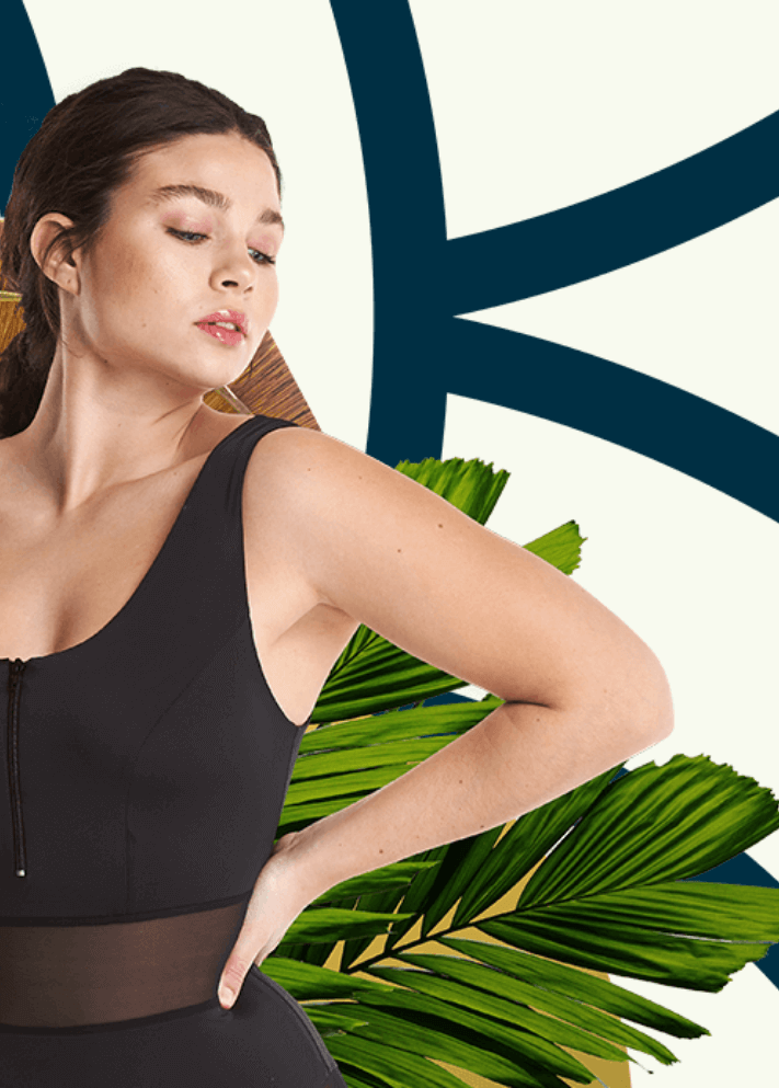
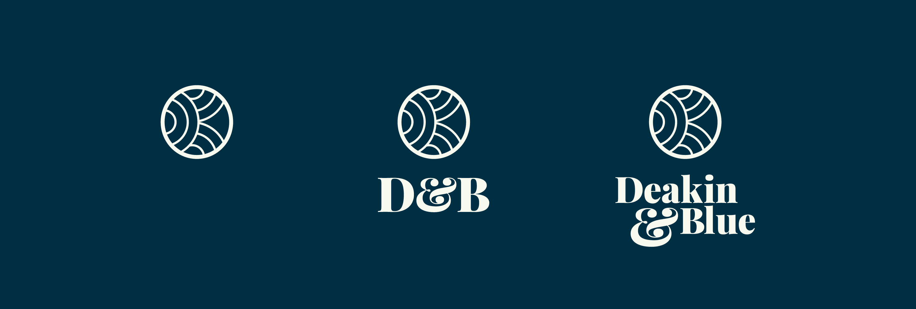
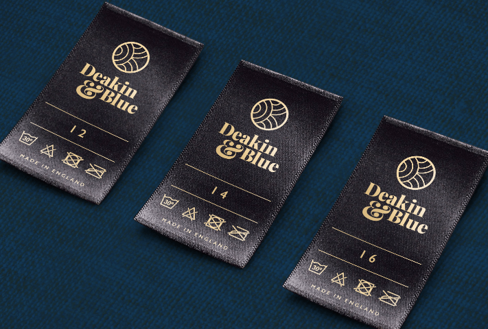
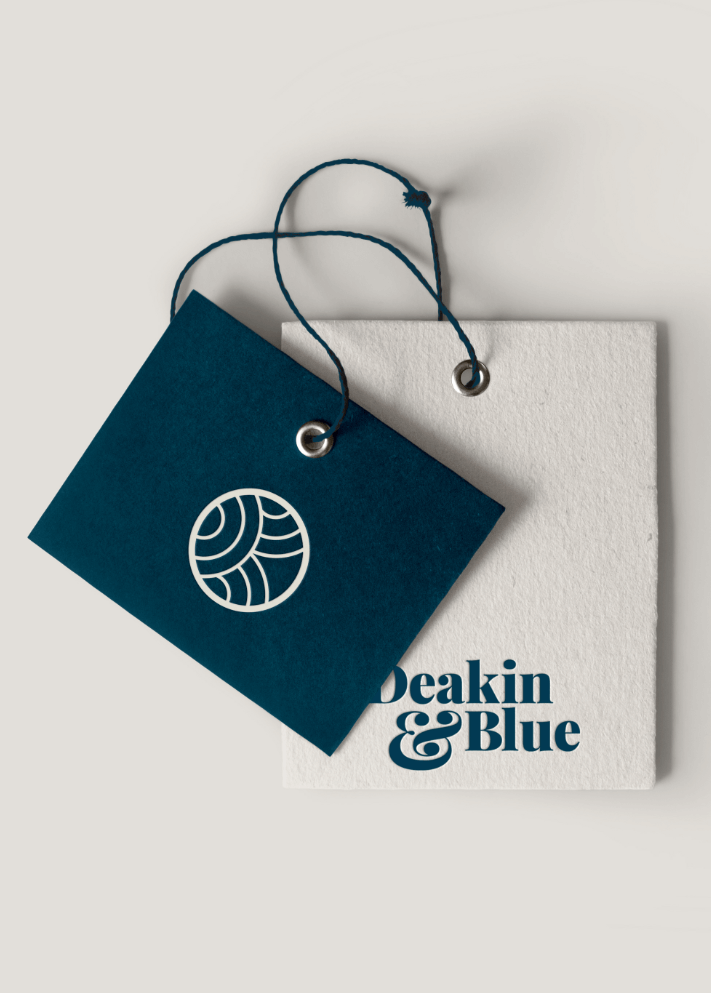
The new brand mark is constructed of concentric water ripples, forming a ‘D’ and a ‘B’.
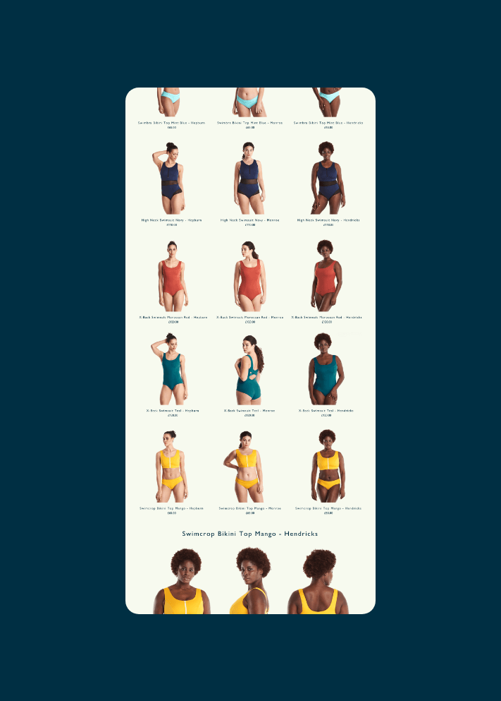
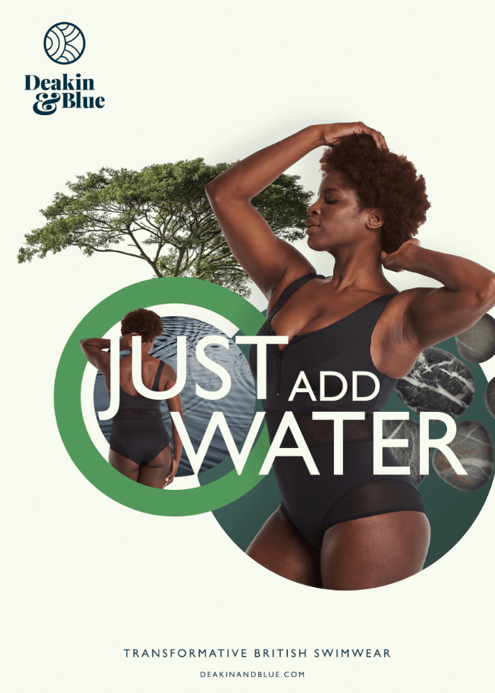
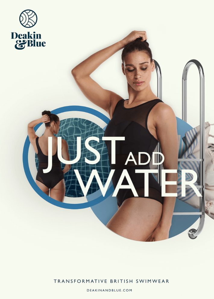
With limited budget for a beach shoot, we decided to capture the brand imagery in a studio and then created a set of montages, each one representing a key swimming environment.
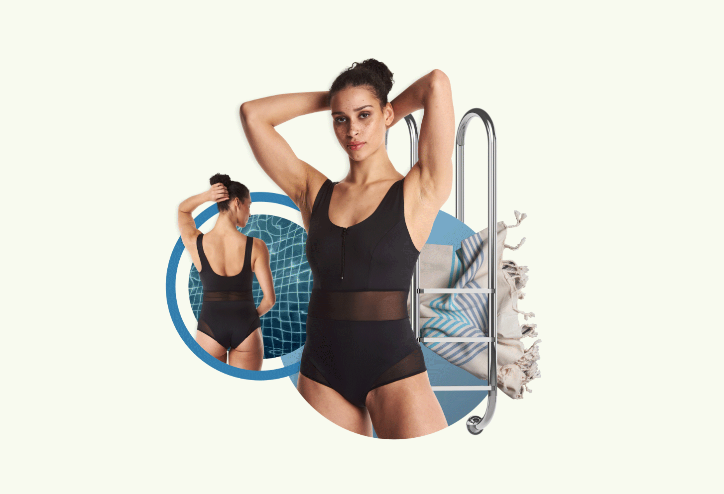
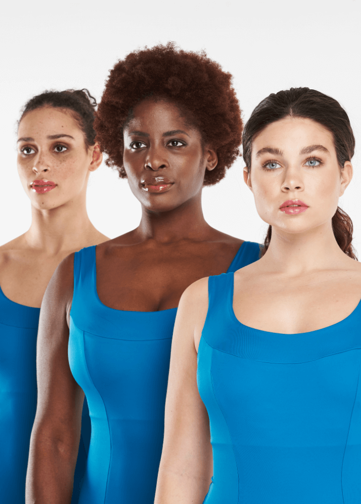
We wanted to capture some timeless art deco style within the new visual language, speaking to the heritage of the brand story. We put a modern spin on this to keep everything looking contemporary.
PepsiCo Health & Nutrition Sciences
PepsiCo Health & Nutrition Sciences are leaders in nutritional education. We worked closely with them to redesign their educational library and to create a new website with a comprehensive research and knowledge repository.
Discipline__
- Brand Identity
- Art Direction
- Print Design
- Illustration
- Project Management
- CMS Development
- UX/UI